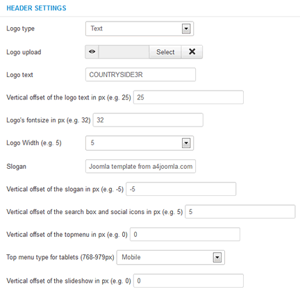
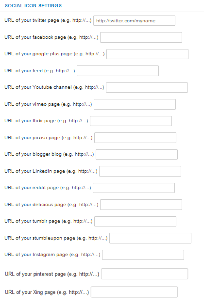
After template installation and choosing it to the default template, click on the template's name in the template manager to set the parameters shown below.
The template uses a 12-column grid, so the Logo width, the Right column width, and the Left column width are the number of columns in the 12 column grid. You may have to play with these settings. Always check how the site looks when you decrease the browser window size, because the template is responsive, and the look of the site changes with the browser (or display) size. For tablet devices you can choose between the mobile topmenu and the horizontal dropdown topmenu. The latter may not be handled well on some tablet devices. But the horizontal menu can also be good for tablets if there are no submenu items.
We removed the old built-in slideshow, and use a 3rd party free responsive slideshow module: Ari Image Slider for demonstration purpose. It's not part of the template, you have to download it, and set it up in its module settings, not in the template parameters.
The social icons will be displayed only if you type some URL for their parameters.


