


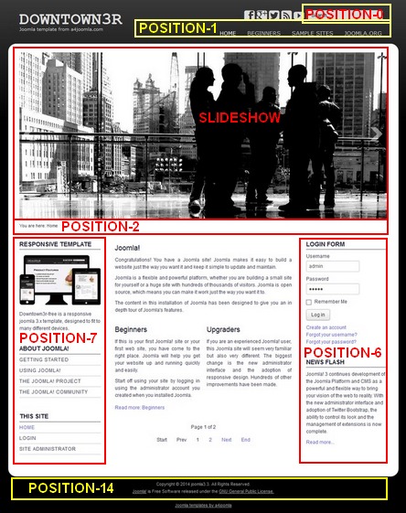
The following module positions exist in this template:
Top menu (horizontal menu) settings:
In the module manager remove everything from the "Menu class suffix" and the "Module class suffix" of this module!
Side menu style
If you want a side menu that looks like the menus on the left, set the "Module class suffix" to _menu and remove everything from the "Menu class suffix"! If you also want to hide it from mobile phones, set it this way:
Module class suffix:_menu hidden-phone
Login module
Set the "Display Labels" to "text" in the module settings, because the other setting is not cross-browser compatible.
Mobile
This template is responsive, so it adapts to the size of the mobile device. You can also see this on a desktop computer when you decrease the size of your browser. But it's worth hiding some of the modules on mobiles, because the order of the content of the website corresponds to the order of that in the source code. For this purpose you can use some css classes for the modules in the "Module class suffix". E.g. type
(space)hidden-phone
into the "Module class suffix" if you want to hide a module from mobile phones. You can read more about this topic if you click here.